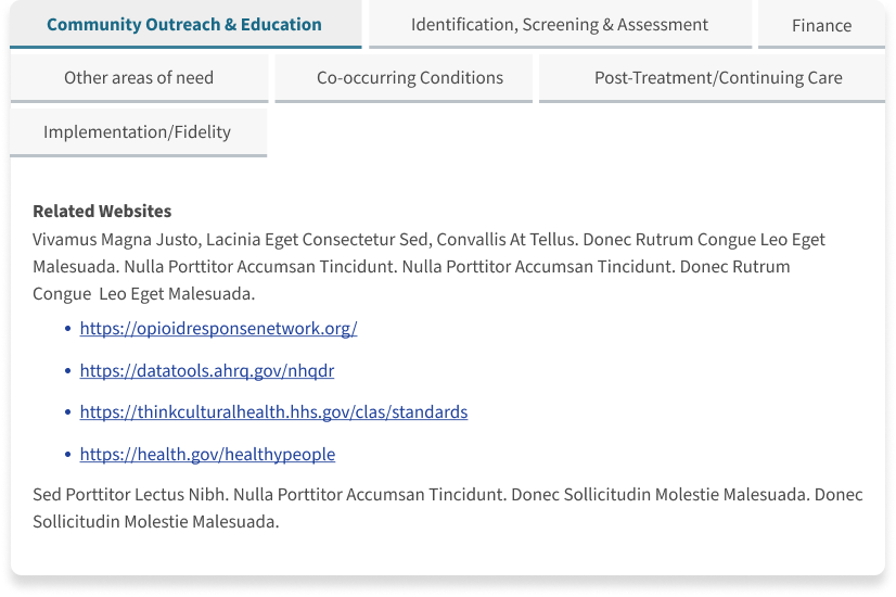
Tabbed Panel Re-design
Overview
A tabbed panel is a component that organizes content into multiple sections, with each section accessible through a tab. It helps present large amounts of information in a clean and manageable format without overwhelming the user. On the SAMHSA website, tabbed panels are often used to display resources, guidelines, and program details, allowing users to navigate quickly between different categories of information.
The redesigned tabbed panel is part of SAMHSA’s initiative to enhance user experience across its platform. By addressing usability challenges and improving accessibility, this new design offers a more intuitive and engaging experience.
The original tabbed panel design had several usability issues:
Cognitive Overload: Displaying all tabs at once cluttered the interface.
Navigation Challenges: Users found it difficult to locate relevant information quickly.
Lack of Responsiveness: The panel did not adapt well to different screen sizes.
Inconsistent Interactions: Hover and click states lacked clear visual feedback.
On mobile, these issues were exacerbated. The previous design presented all tab options vertically, forcing users to scroll excessively and making it difficult to parse content.
Problem
Solution
The redesign introduced a cleaner, more streamlined tabbed panel with the following enhancements:
Improved Navigation: Tabs are clearly distinguishable, with better spacing and visual hierarchy.
Responsive Design: The panel adjusts seamlessly across devices, maintaining a user-friendly experience.
Enhanced Accessibility: Keyboard navigability and screen reader support were prioritized.
Visual Feedback: Improved hover states and focus indicators offer better user guidance.
Mobile-Specific Solution:
To optimize the mobile experience, the tabs were redesigned as accordions. This allows users to expand and collapse sections of interest, reducing cognitive load and ensuring a clean, organized interface. The accordion format offers several benefits:
Reduced Scrolling: The sections are no longer organized in multiple rows of tabs, decreasing page height and preventing users from being overwhelmed by excessive content.
Improved Focus & Better Tap Accuracy: Users can easily tap on one section at a time, enhancing comprehension. Previously, the compact layout with multiple tabs squeezed together made it difficult to tap on the desired tab.
Enhanced Accessibility: Larger touch targets and clear visual indicators improve usability for all users.
Before
Cluttered layout with all tabs grouped closely together, decreasing tab tap accuracy.
Poor readability and inefficient use of space; lack of distinction between different states.
Difficult to navigate quickly.
Visual Comparison - Mobile
Before
Vertical list of tabs forced excessive scrolling.
Difficult to distinguish active sections.
Poor touch accuracy due to tightly packed layout.
After
Clean, minimal interface displaying one tab's content at a time.
Clear tab labels with visual indicators for active states.
Smooth transitions for a more interactive experience.
After
Accordion-style interface reduces scrolling and improves organization.
Larger touch targets for better usability.
Clear visual indicators for expanded sections.
Visual Comparison - Desktop
User Engagement: Increased time on page and interaction with relevant content.
Accessibility Compliance: Achieved WCAG 2.1 compliance for keyboard navigation and screen readers.
Reduced Cognitive Load: Improved user satisfaction and reduced bounce rates.
The redesigned tabbed panel significantly improves the user experience on SAMHSA’s platform. With its cleaner layout, responsive design, and enhanced accessibility, it exemplifies user-centered design principle


