SeKON Enterprise
UX/UI Designer
At Sekon, I was placed under a contract tasked with redesigning the SAMHSA.gov site. The design team’s ultimate goal was to improve the overall user experience, look, and feel to an outdated site while working within the constraints of 508 compliancy, the global standard, and USWDS standards. During my time at Sekon, I completely redesigned the UI of the mobile menu, landing pages, and created custom components that would be implemented within Drupal.
Grants Awards Map Redesign
Grants Awards Map Clickable Prototype
I worked with another UX Designer to redesign the SAMHSA Grants Awards Map, a site page on SAMHSA.gov intended to summarize award data by state and region. The previous design was not intuitive, and did not summarize the awards data. There were no hover styles, and really, no functionality to the current map. Therefore, we were tasked with creating an interface that was interactive, user-friendly, visually appealing, and most importantly, efficient in presenting the data.
Watch the video to understand the updated design!
Case study coming soon.
Mobile Menu Redesign
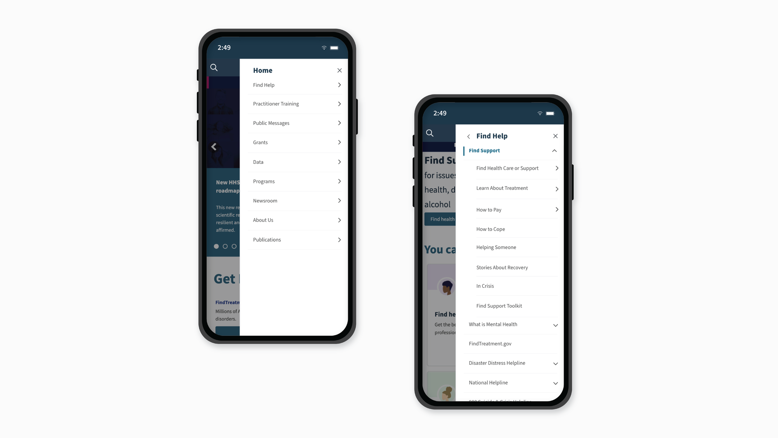

Problem
The SAMHSA mobile menu was outdated and difficult to navigate. The site has a multitude of pages, sections, subsections, and the menu did not make navigating the immense site any easier. The user is unable to know which section they are currently on through the menu, and each subsection has its own menu, which made exploring the menu a long and tiresome process.
Solution
I was tasked with creating a mobile menu that would allow for a smooth and efficient user-experience by rethinking the process of navigating the site menu in order to explore user needs. Through my brainstorming, I came up with a few solutions to create a better menu:
Simplify the overall design by adjusting colors, typography, padding, arrows, and line thickness
Move the menu over to the right instead of the left for the user’s convenience
Rethink the organization of subsections and their menus
Highlight the current page within the menu
Visual changes include:
Menu moved to the right instead of the left to help with user-friendliness
Adjusted padding and line height to help with readability and design
Updated colors to allow for a cleaner and brighter look
Overall, the aesthetic changes simplified the original design and helps provide a smoother user experience

Nested menu drop-downs
A design challenge for this project is the sheer size of the SAMHSA site; there are many, many subpages, with each having its own menu. This means lots of clicking if the user wants to navigate to every sub-section. With the redesign, the new menu utilizes nested menus on an odd/even basis, which keeps things organized but not overwhelming. Subsections are now viewable under their parent section, organized into their own nav bar to avoid overcrowding.
This video demonstrates the functionality of the nested menu drop-downs.
Highlights current site page
With the SAMHSA site being so large, it is more important than ever for the user to be told where they are within the site, especially if they want to explore the site through the menu. In the older design, there was no indication of where the user lies in the site. In the redesign, the section is highlighted in blue to clearly specify the current section.
The previous interface also defaulted to the parent menu instead of the section menu, which can be confusing. The new menu defaults to the current site page the user is on.

Section tap vs arrow tap
The user can easily navigate to sections simply by tapping on the section title, and can tap on the arrow to view subsections.
Watch the side-by-side differences of tapping on an arrow vs a section.
The video illustrates the key differences between the old and new interfaces when navigating to the same site page. Note how it takes a little longer to reach the same page with the older design.
Before and after
The mobile menu is now much smoother and quicker to navigate with the sleek, new look, the addition of nested subsectioned menus, and the blue highlight indicating the current site page.